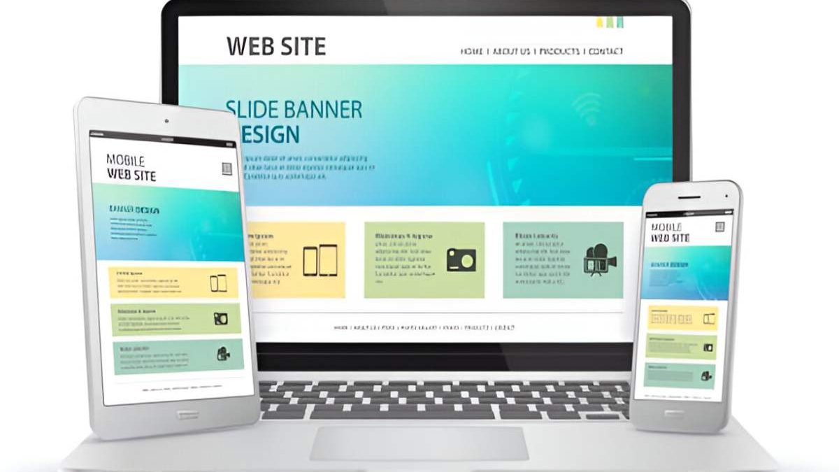
Mobile devices have revolutionized how we access the internet and all the information it contains. As such, mobile-friendly websites are crucial in today’s digital landscape. A mobile-friendly website provides an optimal viewing experience on smaller screens and is essential for businesses that want to stay competitive and reach wider audiences.
With this in mind, let’s explore the importance of having a mobile-friendly website and why your business should prioritize this measure as you look for ways to engage with greater pools of potential customers.
Table of Contents
1. Increased Mobile Usage
Mobile usage surpassed desktop usage a few years ago, and it’s only grown stronger since that threshold was met. According to Statista, mobile devices accounted for more than 50% of all internet traffic in 2021 and nearly 60% of traffic in 2022. This number is expected to rise to 72.6% by 2025. This trend is a clear indication that businesses need to prioritize mobile-friendly websites to reach their target audiences. By providing a positive user experience on mobile devices, companies can increase engagement, drive conversions, and generate more revenue.
2. Improved User Experiences
A mobile-friendly website provides an improved user experience, making it easier for users to navigate the site and find what they’re looking for. A mobile-friendly website should be designed to fit smaller screens, with larger text and buttons available for easy touch navigation.
Your website should also load quickly, as users are more likely to abandon a website that takes too long to load. When your website is mobile-friendly, you’re providing users with a seamless experience, making it easy for them to find what they’re looking for and complete their desired actions.
3. Better Search Engine Optimization (SEO)
Search engines like Google prioritize mobile-friendly websites when they present search results to their users. A mobile-friendly website is more likely to rank higher in search results, increasing its visibility and making it easier for users to find. Plus, if you ensure your website is mobile-friendly, you’ll likely improve your click-through rate and reduce your bounce rate because you’ve designed an experience that has your users’ needs in mind; these factors can help improve your search rankings, as they’re vital components search engines consider when they evaluate how relevant and valuable your site’s content is.
When you prioritize having a mobile-friendly site, your business can improve its SEO efforts and reach wider audiences with less effort.
4. Increased Conversions
A mobile-friendly website can increase conversions by providing users with a positive experience on their mobile devices. Mobile-friendly websites should be designed to make it easy for users to complete their desired actions, whether that means making purchases, filling out forms, or contacting the business directly.
As you look to ensure your site is mobile-friendly, make sure you provide customers with a streamlined checkout process if you offer goods and services for sale online, making it easy for would-be customers to complete their purchases with ease.
By providing a positive mobile experience, your business can increase its conversions and generate more revenue.
5. Improved Customer Satisfaction
A mobile-friendly website can improve customer satisfaction by providing users with an easy-to-use and accessible website on their mobile devices. A great design will provide users with the information they need, in a format that’s easy to read and understand. When created well, your website will ensure an easy-to-navigate experience, making it simple for visitors to complete whatever action they’re trying to achieve. Putting design at the forefront of your process ensures an endgame of improving customer satisfaction and increasing customer loyalty.
6. Increased Brand Awareness
Mobile-friendly websites can increase brand awareness by reaching more people. Since mobile usage has been consistently on the rise for several years, your marketing and design teams need to understand that your potential and existing customers live on their mobile devices.
During the creation of your new or soon-to-be-redesigned mobile experience, make sure it’s easy for users to share your content, which will increase your brand’s visibility and reach. Leaning on your existing audience is a great (organic) way to build trust with people who dwell in their circles, and those people might, too, become loyal followers of your brand.
7. A Cost-Effective Solution
Often, you can develop a mobile-friendly website without breaking the bank. Today, many of the web CMS options have this functionality built into their templates. And, of course, if you work with a professional digital marketing agency, your team of choice will put mobile-friendliness at the forefront of their design process as they work with you to discover your goals, customers’ expectations, and end vision.
In the world of cost-effectiveness, it’s not just about the money you put into the design itself; it’s also about the money the design can bring back to your brand. About the SEO efforts we discussed above, you can drive more organic traffic back to your site when your design is mobile-friendly. This means you’re bringing people to your site simply because your design and content are viewed as optimal by Google and the search engine gang. Sure, PPC and paid advertising efforts are important elements of a healthy digital marketing strategy, but when you can pull in traffic organically, you’re not paying for those eyes to view your brand. As such, you’ll ultimately begin to realize positive ROI simply because you’ve designed your site to work for your audience where they are when they want to learn more about your business.
8. Ready Accessibility
Given today’s remote workforce and always-on-the-go consumer base, it’s important to ensure that your website is always accessible to your audience.
By creating a mobile-friendly website, you’re ensuring that people can poke around your site on any given device, including their phones or tablets, at times that work best for their discovery efforts. Giving people the information they need in whatever format works best for them will ensure higher engagement and conversions.
9. Remaining Competitive
We can’t gloss over this point — your competitors have mobile-friendly websites, which means if you don’t, you’re losing business to the other guys. You may not be able to quantify this loss based on analytics, necessarily, but we can promise you that if someone comes to your site when they’re on their phone and can’t easily navigate your pages or complete the tasks they’re trying to accomplish, they more than likely won’t hesitate to leave your site and head to those of your competitors. When they’re already frustrated and simply trying to find a product or service that suits their needs, consumers are going to jump at the chance of completing a transaction on your competitors’ mobile sites when yours is subpar.
To head off this frustration and lead loss, make sure your website is ready to accept visitors from any device, including their phones.
Final Thoughts on Creating a Mobile-Friendly Website
Whether you want to make it easier for customers to contact you or you want to ensure people can find the products and services you offer with ease, the importance of a mobile-friendly website cannot be overstressed in this day and age. There was a time when mobile responsiveness was a cool thing for companies to showcase; today, it’s an imperative element your brand cannot be without.
Also read: Qoruv.com Pioneering Firm: Shaping the Future of Marketing